Role:
Design Lead
Founder:
Emon Motamedi
Timeline:
July 2020- Present
I designed Florian’s website pages, building them in Webflow as well as creating graphics for the website and social media pages. Since the website was launched, I have turned my attention to website maintenance and social media.

Florian is a new way of paying for your college education and expenses without taking on loans or credit-card debt. Back by a community of alumni, Florian gives students up to $30K to pay off their loans while providing mentorship to help them accelerate their careers. Students pay back a percentage of their income once they start working full-time, which means they only repay what you can afford.
As Florian expands from a small startup to a nationwide organization, the company wants its website to have a sleek, professional look, providing the necessary basic information to ensure a smooth onboarding process.
Meet Studious Samantha - As a student at UCLA, Samantha spends most of her time in class or studying for her exams. She is very active on campus, being a part of many clubs and extracurricular activities. The thought of paying for college on her own causes Samantha a lot of stress and figuring out her options takes up too much of her time.

Right away we started sketching different design solutions that would provide the necessary information and emulate Florians's values while keeping a consistent branding throughout the entire site. This design studio helped us lock in the key features most important to Florian.


Rather than being seen as a company, Florian wants to be a community where university alumni help current students by providing them with loans, as well as career services and personal support. They emphasized community by displaying alumni and supporters' pictures, as well as the companies they work at.
To make it easier for users to navigate the website, we created multiple opportunities for the user to be directed to our sign up page, as well as putting a "join us" button at the top.


We created a section documenting student experiences with Florian. By adding this section, a new user can more relate to the service and hopefully decided Florain is right for them.
As Florian grew, we turned our focus to creating a community feel while still presenting professionalism and legitimacy on the website. Throughout the development process we made improvements to our photo banner, information layout and made the website more interactive.
We replaced our banner image with a collage of alumni and rewrote the copy. With the banner being the first thing the user sees, we wanted to set the tone of community right away. By showing real faces of students and alumni, the user relates more to the company.


By changing the order of specific sections, we prioritized the most important information on the website for a smoother user experience. Students can have all their general questions answered by scrolling down the homepage.
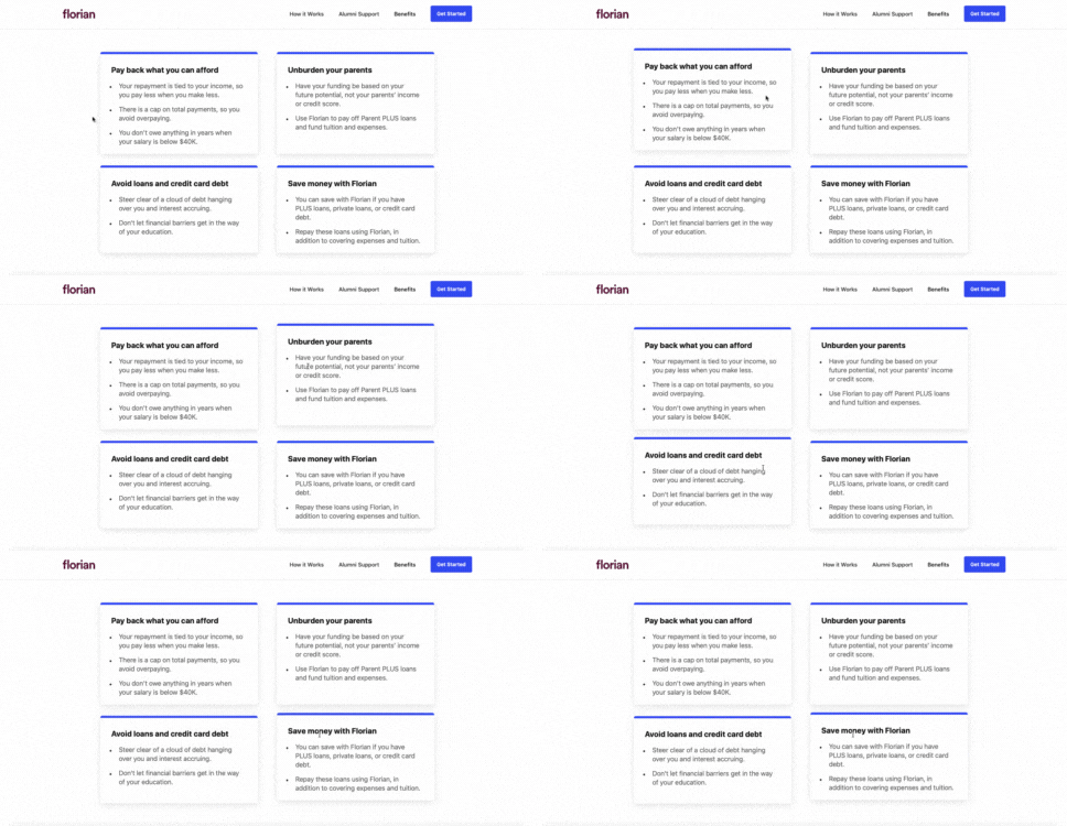
After we finalized the order of information, we added in interactions and animation to give the website voice and personality. The target audience is young adults, so making the website more playful makes the whole topic of college loans less scary.

We hope that one day students all over the country will be using Florian to help pay for their tuition. As we are currently expanding Florian's reach from UC Berekely to students at UCLA, Michigan and University of Texas, new pages are being developed for the website.
Soon we will be developing a page introducing the staff and the company values, a career services page, and a page dedicated to a more in-depth explanation of the Florian process.

