
The Museum of Modern Art is an art museum located in Midtown Manhattan, New York City. It plays a major role in developing and collecting modern art, and is often identified as one of the largest and most influential museums of modern art in the world.
As a result of the Covid-19 pandemic, MoMA was forced to close. Without visitors, the museum has made major cuts to their staff and overall budget. MoMA wanted an application that provides users across the world with an in-person museum experience.
Teammates:
Researchers: Smith Robertson &Keon Henderson
Designers: Shannon Yogerst & June Kwon
Software: Figma, Photoshop, Illustrator, Google Drive
Timeline: Two week design sprint- November 2020
My Role: As the design lead, I was in charge of the overall design of the application and presentation but I was also involved with almost every other part of the UX process. I gathered data, analyzed museums apps for a competitive analysis, and conducted user interviews.
Our team’s process is based on the Double Diamond Theory. We used discovery, definition, ideation and implementation to come up with MoMA’s solution.

Meet Sandra Reyes - An interior designer, educator and art lover. She longs to be inspired by the contemporary museum atmosphere and does not believe a virtual experience could fill the void.
Sandra needs a safe and engaging way to enjoy the curated museums experience.


Paper sketches were the quickest way to get our ideas out and bounce them off our team. We did a design studio to quickly generate potential layouts and design choices we would take into our later iterations. From this we found some key features we wanted to implement in our greyscale prototype.
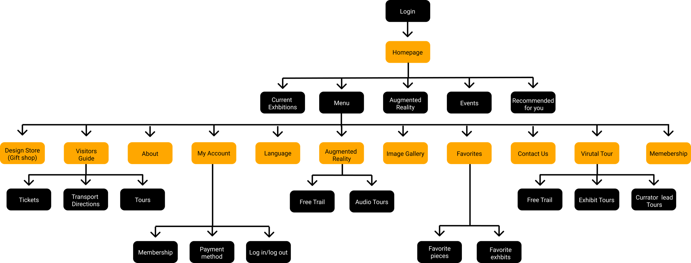
Once we determined the features and information to go into the application, we created a navigation scheme to show the applications structure and hierarchy.


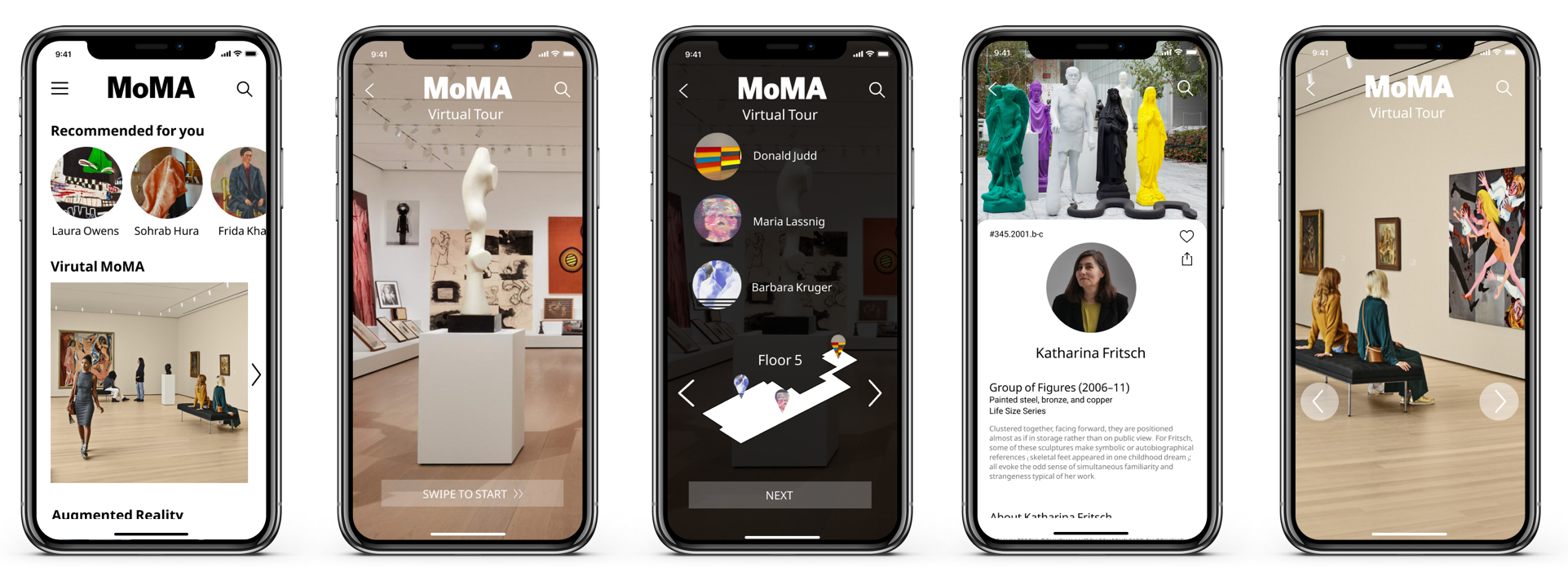
Users can explore the MoMa Museum through the virtual tour. By selecting the different floors on the map they can explore the current exhibits on view. They have the opportunity to get a up-close view of the art and more information about the artists.
We took the idea of bringing the museum to the user by allowing them to virtually place works of art in their own homes.


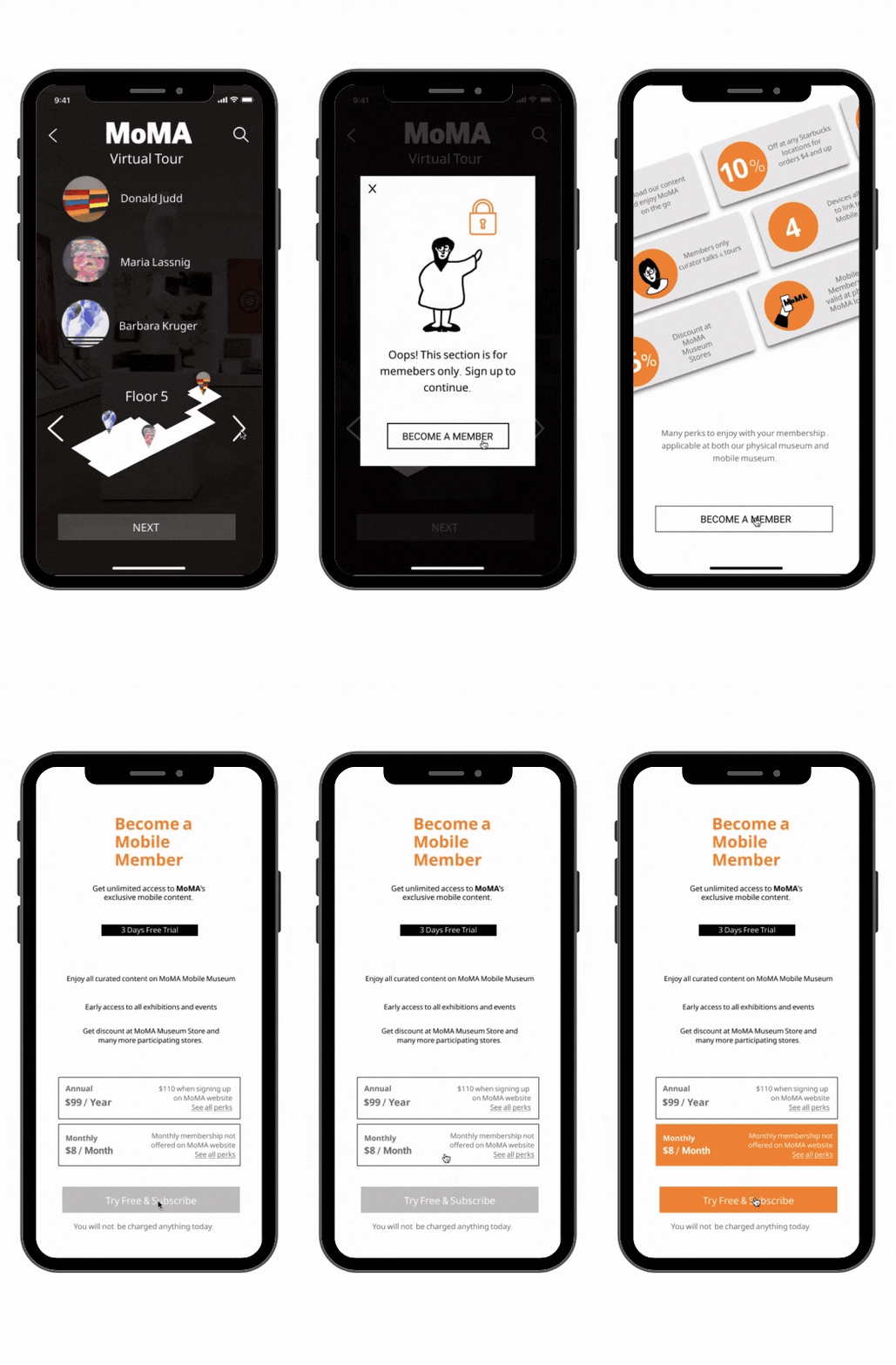
To encourage users to sign up for our app's membership program we locked certain sections of the app. This is where our team added the gallery attendant and curator Irene. She is the face of the application. Throughout the app you will run into her and she is more than happy to assist you!

It was at the greyscale stage we really wanted to focus on design and functionality. Our goal was to better understand the best way to organize the information and content the users were going to have. We developed a prototype that we thought would best encompass MoMA’s vision and the users needs but the only way to know for sure was to do user testing.

We did three rounds of usability testing with three usability tests each round. We selected people based on their knowledge of museums and art. We interviewed a developer at MoMA, a professional artist, and the MIT Museum’s Curator of Architecture & Design.
After our last round of usability testing we turned our focus to three major problems to perfect. We continued to make improvements to our augmented reality experience, created a more interactive museum map, and made some final adjustments to our colors to make sure the app is as accessible as possible.
Users were confused about how to use and interact with our augmented reality feature. They weren’t sure what they were supposed to be doing or looking for so we added a series of instructions with illustrations to make that as clear as possible.


We changed the MoMA map to make it more interactive. We originally has just an illustration of the map with little information about what was on each floor. In our final design users have the opportunity to scroll through different floors and get more information about the exhibits and events taking place during the tour. With this visual map, users can view more art in a shorter amount of time.
For our next steps, we want to put more time into accessibility and ADA compliance solutions, making this an app that everyone can use and enjoy. Many of our users expressed that there is so much more to the museum experience than the art itself. They enjoy the entire atmosphere so we want to capture the entire experience for everyone at home, starting with implementing audio and visual features for the visually and hearing impaired.
We also would like to spend more time making this an application that will be used post pandemic. Once people start visiting museums again we want the MoMA app to play a vital role in their in-person experience with features like guided audio tours, online ticket booking and museum event information.

